
In 2002, Logsdon and his colleagues published a report which included a survey of 37 drinking water treatment plants and their practices in selecting their coagulation conditions and measuring their performance. They reported that greater than 85% relied on historical plant data in the decision-making process. In theory, historical data would allow operators to make informed decisions regarding their day-to-day operations and always be a step ahead instead of merely reacting to water quality changes as it occurs.

Today, drinking water treatment plants are generating enormous amounts of data from daily/hourly log sheets, online instrumentation, and SCADA systems. However, only having data and not using it is as good as not having any data at all. Unfortunately, I've been to many plants that dedicate considerable resources to painstakingly measure and record several water quality parameters and plant conditions only to put all that data and hard work in a binder and file it in a cabinet at the end of the day. But what can we do with this data, besides having a physical log of how the plant was doing that day?
Some plants use spreadsheets with tables of maximum or average values. These are great for summarizing and reporting a treatment plant's performance; however, that information has little to no value when it comes to making informed decisions or diagnosing problems.
The Key is Data Visualization
Human brains are phenomenal at recognizing patterns. Your SCADA or sophisticated data management system might already be helping you visualize some of your data; however, these systems are not always very user-friendly and sometimes even limited in functionality. Sometimes you need to plot two or more parameters against other (e.g. coagulant dose versus raw and settled water turbidity) to determine how they correlate (or don’t) with each other.
It also important not to confuse fluctuations with trends. Fluctuations are a normal part of drinking water treatment operation. These can occur hourly, daily, and even weekly. Operators must constantly make adjustments to stay in the sweet spot where they maximize performance while minimizing treatment costs. Therefore, they would have to decide if their observations are due to fluctuations (probably normal) or trends (something is changing).
Fortunately, you don't need a PhD to find patterns in your data. You simply need the right tools to do it. Spreadsheets are great and relatively easy to use but maintaining them can become a challenge when working with large data sets.
Below is a spreadsheet I put together for a treatment plant we worked with in the past to help them keep track and visualize their data with very little work.
An Easier Way for Logging and Visualizing Data
The spreadsheet consists of 3 sheets. After entering the parameters you'd like to monitor and the names of the operators, the "Main" tab is what you'll be interacting with almost entirely.
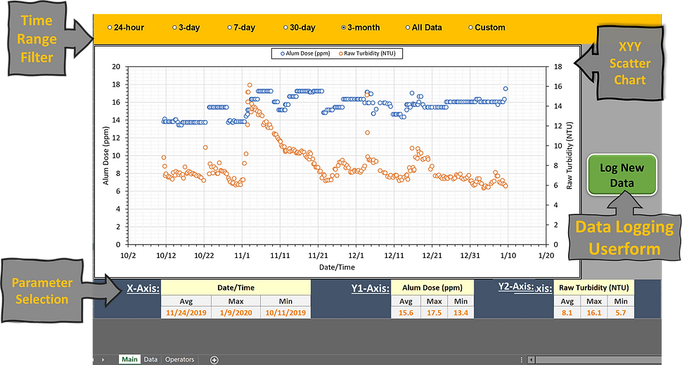
The top row contains option buttons that allow you to quickly filter the data based on the selected time range. For example, selecting "3-day" will only display data from the 3 most recent days. You also have the option of entering a custom time range. Textboxes appear when you select the "Custom" option.
The middle section contains the XYY chart and the data logging button. Users can easily plot data by selecting parameters for the x, y1, and y2 axes from drop-down menus in the bottom row (yellow cells). The range, axis titles, and legend are automatically updated based on the selected parameters.

The average, minimum, and maximum values of the selected parameter are automatically calculated. Note that these values are based on what ever time range you select. So if you select "30-day", the average/min/max of the last 30 days will be automatically calculated.
Clicking the "Log New Data" button will launch the data entry userform.

The date field is automatically populated with the current date and time. The operator then selects their name from the drop down menu and enters values for the user specified parameters. Clicking "Add to sheet" copies all the entries to the last row in the "Data" tab. User can specify the parameters they would like to monitor by changing the column headers in the "Data" tab. Changing the column headers will also automatically update the parameter list on the "Main" tab.

The last step is to enter the names of the operators that will be using the spreadsheet in the "Operators" tab. The list will be automatically updated in the data logging userform.

If you run into any issues with the spreadsheet or have ideas for making it even better please let me know. You can reach me at: amiralansari89@gmail.com
Comments